Estimating assortativity in transmission networks
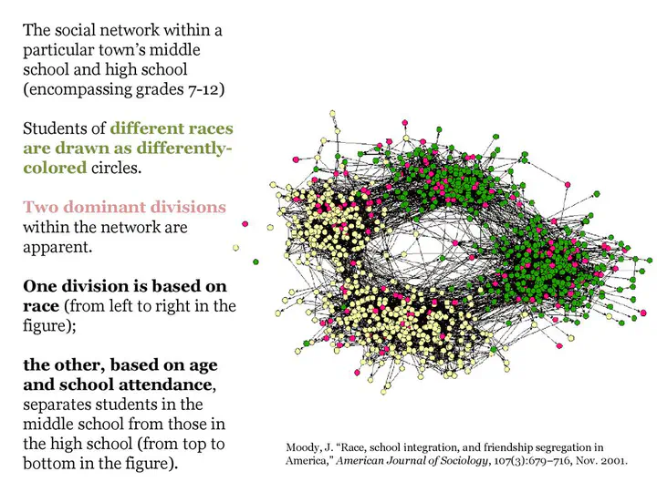 James Moody (2001)
Overview
The work below is in progress, if you have any questions please drop me an email at c.geismar21@imperial.ac.uk.
Assortativity refers to the tendency of individuals to interact preferentially with others who are similar to them in certain attributes. The assortativity coefficient delta plays a crucial role in modeling epidemics by capturing the mixing patterns within a population. In the context of epidemics, assortativity specifically measures the extent to which infections are more likely to spread within certain groups compared to others. A delta value greater than 1 indicates that individuals are more likely to interact and transmit infections within their own group, while a delta value below 1 suggests a tendency for infections to spread across different groups.
The assortativity coefficient has significant implications for epidemic dynamics. High assortativity can lead to concentrated outbreaks within specific groups, potentially resulting in faster spread and larger clusters of infected individuals. Conversely, low assortativity promotes more even mixing between groups, which may lead to a more widespread but potentially slower epidemic.
Changes in assortativity over time can indicate shifts in behavior or social interactions that may impact the spread of the disease. As a result, the assortativity coefficient can serve as an informative indicator of the effectiveness of non-pharmaceutical interventions, such as physical distancing measures or targeted interventions within specific groups.
The o2groups package provides a framework for modeling outbreaks using branching processes specifically designed for scenarios involving multiple groups.
Installation
#devtools::install_github("CyGei/o2groups")
library(o2groups)
#library(tidyverse)
Example
Simulation
We first specify the input parameters for our simulation.
n_simulations = 100
n_cores = parallel::detectCores() - 2
duration = 100
n_groups = 4
size = c(1e3, 1e4, 1e3, 1e3)
name = LETTERS[1:n_groups]
delta = c(10, 2, 0.1, 4)
intro_group = LETTERS[1:n_groups]
intro_n = rep(10, n_groups)
r0 = c(3, 4, 2, 3.5)
generation_time = simulacr::make_disc_gamma(mean = 5, sd = 2)$d(1:30)
We then run the outbreak simulation 100 times to account for stochasticity.
set.seed(123)

  out <-
  simulate_groups_furrr(
    n_simulations = n_simulations,
    duration = duration,
    n_groups = n_groups,
    size = size,
    name = name,
    delta = delta,
    intro_group = intro_group,
    intro_n = intro_n,
    r0 = r0,
    generation_time = simulacr::make_disc_gamma(mean = 5, sd = 2)$d(1:30) )

data = out$data
stats = out$stats
data$date_onset <- data$date_infection + simulacr::make_disc_gamma(mean = 4, sd = 1)$r(nrow(data))
Depletion of susceptibles
pal = c("A" = "magenta", "B" = "orange", "C" = "forestgreen", "D" = "steelblue")
gg_col <- list(
  scale_color_manual(values = pal),
  scale_fill_manual(values = pal)
)
gg_scale <- list(scale_x_continuous(breaks = seq(0,100,10)))

#first 500 cases timed network:
plot_tree(subset(data, simulation == 1)[1:500,], pal = pal)
#plot_stats(stats)[[1]] + gg_col + gg_scale
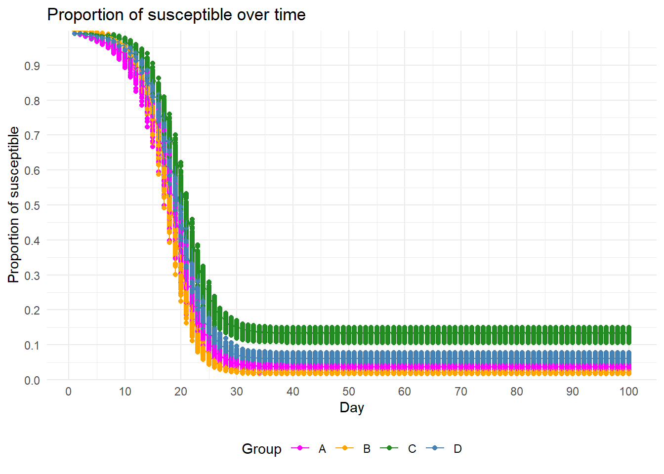
plot_stats(stats)[[2]] + gg_col  + gg_scale
Case Reproduction Number
# Individual Ri value
Ri <-
  map(.x = unique(data$simulation), ~ get_Ri(data[data$simulation == .x, ])) %>%
  bind_rows(., .id = "simulation")
Ri_long <- Ri %>%
  pivot_longer(cols = name,
               names_to = "target") %>%
  select(simulation, id, group, target, value, date_onset)
## Warning: Using an external vector in selections was deprecated in tidyselect 1.1.0.
## ℹ Please use `all_of()` or `any_of()` instead.
##   # Was:
##   data %>% select(name)
##
##   # Now:
##   data %>% select(all_of(name))
##
## See <https://tidyselect.r-lib.org/reference/faq-external-vector.html>.
# summary Ri
Ri_sims <- Ri_long %>%
  group_by(group, target, date_onset, simulation) %>%
  summarise(Ri = mean(value))
Ri_means <- Ri_sims %>%
  group_by(group, target, date_onset) %>%
  summarise(Ri = mean(Ri))

# plot
p_facet_Ri <- ggplot(data = Ri_sims,
                     aes(x = date_onset,
                         y = Ri,
                         col = group)) +
  facet_grid(target ~ group, scales = "free_y") +
  geom_point(alpha = 0.5) +
  geom_line(data = Ri_means,
            col = "black") +
  theme_bw()+
  theme(axis.text.x = element_blank(),
        axis.ticks.x = element_blank(),
        axis.title.x = element_blank(),
        legend.position = "none") +
  gg_col +
  gg_scale+
  scale_y_continuous(breaks = 0:10)


total_Ri_sims <- Ri %>%
  group_by(simulation, group, date_onset) %>%
  summarise(Ri = mean(Ri))

total_Ri_means<- Ri %>%
  group_by(group, date_onset) %>%
  summarise(Ri = mean(Ri))

p_total_Ri <- ggplot(total_Ri_sims,
                     aes(x = date_onset,
                         y = Ri,
                         col = group,
                         group = group)) +
  geom_point() +
  geom_line(data = total_Ri_means,
            col = "black") +
  geom_hline(data = tibble(group = name,
                           r0 = r0 ),
             aes(yintercept = r0, group = group),
             col = "#4C4E52", lty = "solid")+
  geom_hline(aes(yintercept = 1), col = "#4C4E52", lty = "dotted")+
  facet_grid(~ group) +
  theme_bw()+
  theme( strip.text.x = element_blank(),
         legend.position = "none")+
  gg_col +
  gg_scale+
  scale_y_continuous(breaks = seq(0,10, 2))

patchwork::wrap_plots(p_facet_Ri,p_total_Ri, ncol = 1, guides = "collect",
                      heights = c(3,1))
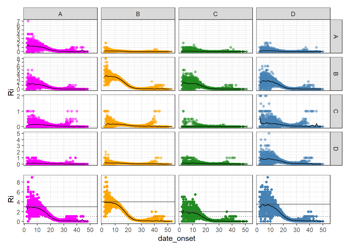
The plot above describes the average number of secondary cases a primary case from a given group (columns) generates in every group (rows) over time.
Mixing
For each simulation, we compute the mixing matrix for each date of onset. We also compute summary statistics.
mix_t <- map(.x = unique(data$simulation),
             function(sim){
               sim_data <- filter(data, simulation == sim)
               map(.x = unique(sim_data$date_onset),
                   function(date){
                     mix <- sim_data %>% get_mixing(., min_t = date, max_t = date)
                     return(mix$result)
                   }) %>%
                 bind_rows(., .id = "t") %>%
                 mutate(t = as.integer(t))
             }) %>%
  bind_rows(., .id = "simulation") %>%
  mutate(across(c(source_group, group),
                ~factor(., levels = name)))

#compute summary stats
mean_freqs <- mix_t %>%
  group_by(t, source_group, group) %>%
  summarise(freq = mean(freq))

#mixing from 10 - 20 days
Mcol_df <- mix_t %>%
  filter(t <=20 & t >= 10) %>%
  group_by(source_group, group) %>%
  summarise(freq = mean(freq))

Truth <- generate_Mcol( n_groups = n_groups,
                        size = size,
                        name = name,
                        delta = delta) %>%
  as.data.frame(.) %>%
  rownames_to_column(var = "group") %>%
  pivot_longer(-group, names_to = "source_group", values_to = "value") %>%
  select(source_group, group, value) %>%
  arrange(source_group)
ggplot(mix_t) +
  aes(x = t,
      y = freq ,
      col = source_group) +
  facet_grid(group ~ source_group) +
  geom_point() +
  geom_vline(aes(xintercept = 20), lty = "dashed") +
  geom_line(data = mean_freqs, col = "#4C4E52")+
  geom_segment(data = Mcol_df, aes(x = 10, xend = 20, y = freq, yend = freq),
               size = 1, col = "black")+
  geom_point(data = Mcol_df, aes(median(10:20), y = freq),
             size = 2, col = "black")+
  geom_hline(data = Truth,
             aes(yintercept = value), lty = "dotted")+
  theme_bw()+
  theme(legend.position = "none")+
  gg_col +
  gg_scale
## Warning: Using `size` aesthetic for lines was deprecated in ggplot2 3.4.0.
## ℹ Please use `linewidth` instead.
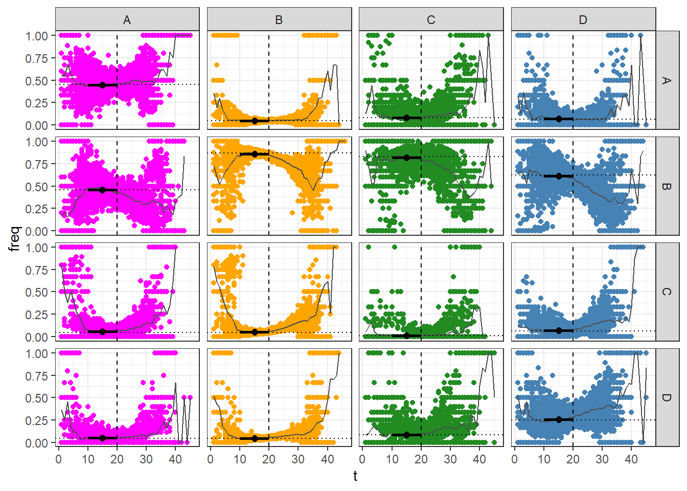
The plot above illustrates the temporal evolution of group infection mixing. Each data point corresponds to the percentage of infections originating from a particular group (column) and spreading to another group (row) at time t. The solid grey line represents the average infection mixing frequency, while the dotted line represents the initial mixing frequency. The point/error-bar display the average mixing captured in the early stage of the epidemic.
Retrieve delta
The previous plot highlighted how saturation affects the infection mixing proportions.
Early Phase
Delta values can be derived from the groups’ sizes and the observed mixing frequencies during the initial stage of the epidemic, when most of the groups’ individuals are susceptible.
Note that it is important to find the right early phase window to retrieve the appropriate mixing matrix (Mcol_observed).
#early phase estimation
early_delta(data, 0, 10, size, name) %>% round(., digits = 2)
##     est lower_ci upper_ci successes trials
## A 10.02     9.35    10.75      1471   3232
## B  1.95     1.84     2.07      8140   9392
## C  0.07     0.03     0.13        10   1693
## D  3.84     3.55     4.16       826   3405
#true values
delta
## [1] 10.0 2.0 0.1 4.0
#we can also chose the peak date for individual groups as reference to estimate delta with more prescision for each group
At any time point
In addition, we can estimate delta at any given time point by incorporating additional information such as the group’s basic reproduction number (R0) and the proportion of susceptible individuals at a specific time (t). The code below estimates the group’s delta over every time point for each simulation .
future::plan("future::multisession")
output_list <- future.apply::future_lapply(seq_len(n_simulations), function(sim) {
  data_subset <- data[data$simulation == sim, ]
  unique_dates <- unique(data_subset$date_onset)

  output <- lapply(seq_along(unique_dates), function(tp) {
    stats_subset <- stats[stats$simulation == sim & stats$time == tp, ]
    prop_sus <- stats_subset$prop_susceptible

    Mcolt_observed <- get_mixing(data_subset, min_t = tp, max_t = tp)$Mcol
    delta_optim <- Mcolt_to_delta_optim(
      n_groups = n_groups,
      size = size,
      name = name,
      r0 = r0,
      prop_susceptible = prop_sus,
      Mcolt_observed = Mcolt_observed
    )
    output <- c(delta_optim, sim, tp)

  })

  output <- do.call(rbind, output)
})
combined_output <- do.call(rbind, output_list) %>%
  as.data.frame()
names(combined_output) <- c(name, "simulation", "timepoint")
However, it is important to note that estimating delta during the early or late timepoints of the epidemic may be less reliable due to potential limitations in sample size.
combined_output %>%
  pivot_longer(
    cols = -c(timepoint, simulation),
    names_to = "group",
    values_to = "delta"
  ) %>%
  group_by(group, timepoint) %>%
  summarise(
    estimate = mean(delta),
    lower_Q = quantile(delta, 0.1),
    upper_Q = quantile(delta, 0.9)
  ) %>%
  ungroup() %>%
  filter(timepoint >= 14 & timepoint <= 30) %>%
  ggplot(aes(x = timepoint, y = estimate, group = group))+
  geom_point(aes(col = group))+
  geom_line(aes(col = group))+
  geom_ribbon(aes(ymin = lower_Q, ymax = upper_Q, fill = group), alpha = 0.1)+
  geom_hline(data = tibble(delta = delta,
                           group = name),
             aes(yintercept = delta, col = group), lty = "dotted")+
  gg_col+
  theme_bw()
## `summarise()` has grouped output by 'group'. You can override using the
## `.groups` argument.
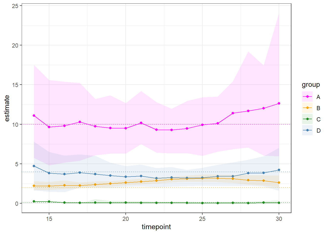
The plot above highlights the delta estimate & 90 % quantile computed at every time-point during the outbreak between day 14 and 30.